St Thomas More Catholic School
Website Redesign

Situation
St. Thomas More is a successful K-8th grade private Catholic school located in the Twin Cities. St. Thomas More approached my team seeking recommendations for improving the experiences of teachers and administrators as they use the school’s Student Information System (SIS). This system is used to manage student information including taking attendance, grade management and running reports.
Tools & Methods
Cognitive Walkthrough
Zoom
Primary User Research Protocol
Sketch
Invision App
Cognitive Walkthrough
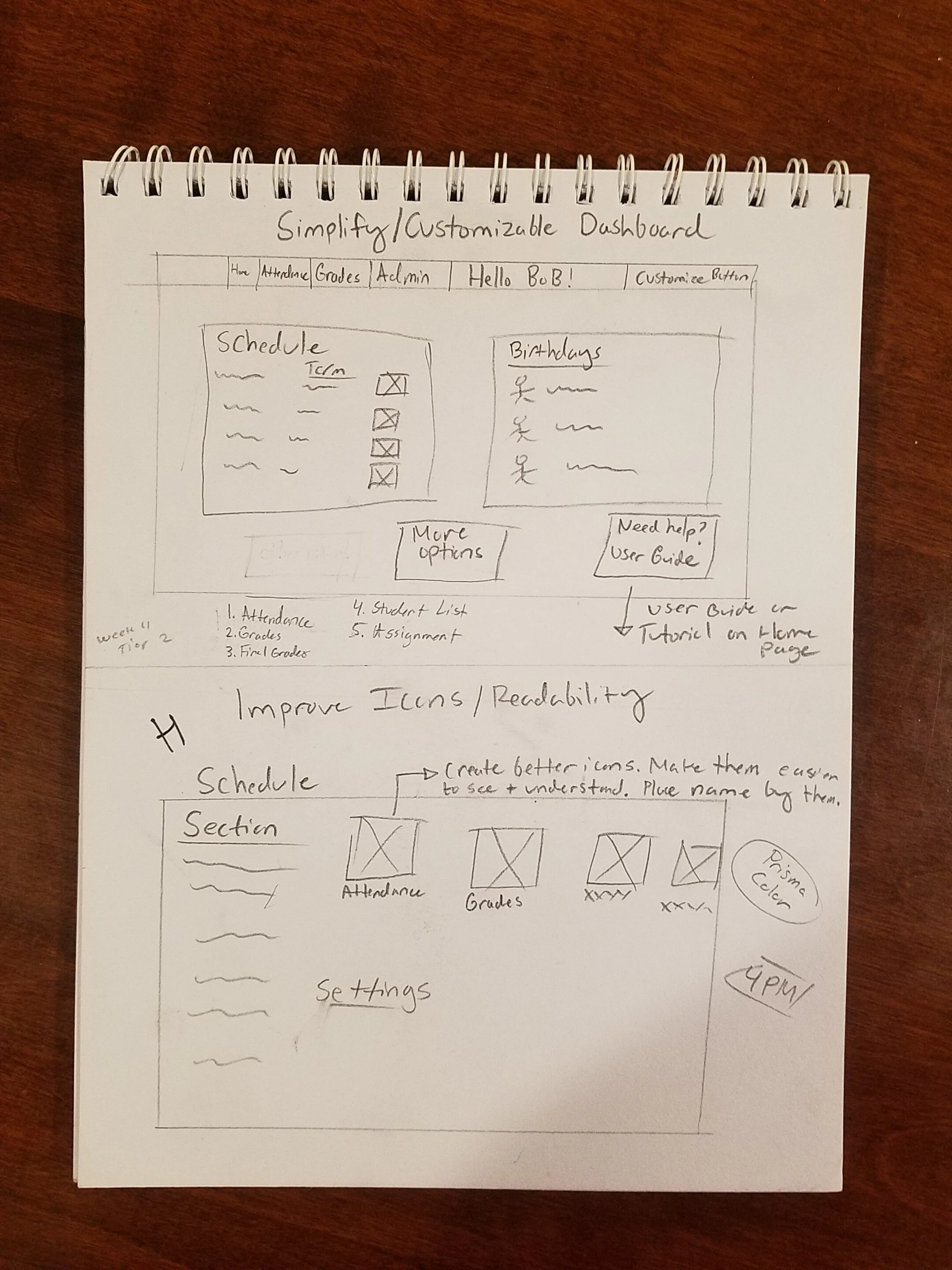
St. Thomas More provided us with several videos and screenshots that showed users performing tasks within the program. My cognitive walkthrough focused on the primary tasks of taking attendance, updating attendance, adding assignments and adding grades. After synthesizing the information provided I concluded that users were experiencing the most difficulty when it came to the program’s Hierarchy and Consistency. Users seemed to have trouble with navigating through program and reading the content on the page due to the small size and inconsistent layout. Many icons that users clicked on did not follow a regular mental model and one user expressed that they would often forget what each icon was. I developed a hypothesis that users would want an easier interface to navigate through and perhaps customization options.
Primary User Research Session

I reconvened with my team and we synthesized our findings. We created a Primary Research Protocol and performed research sessions with several teachers and administrators. Our sessions were done via Zoom and lasted an hour each. I found that all users expressed that navigating through the program was difficult because each screen was cluttered and hard to read due to font size. One of our users mentioned that he prefers to take attendance and set up grades via pen and paper because it’s more efficient. My hypothesis was proven right and I dove into sketching out a redesign of the program screens.
Home Page Dashboard Wireframes

After analyzing my findings I decided that redesigning the user dashboard and adding accessibility settings would benefit the users the most. The refined dashboard I envisioned as having customizable widgets and buttons that users could adjust to their liking. This would help speed up the process of navigating throughout the program and would reduce the clutter. The program has limited accessibility settings that were difficult to find. I decided that incorporating additional accessibility settings would contribute to more teachers and administrators feeling comfortable with the program.

Dashboard
Digitized Prototype

Accessibility Options
My digitized prototypes were created through Sketch. I focused on making the dashboard as simplistic as possible. I incorporated customization options and enlarged the microcopy. I incorporated Vision, Hearing and Dexterity options in the accessibility menu in order to make the program usable by as many people as possible. I created an Interactive Prototype Tour that can be viewed by clicking here.